Ludo Board Color Combinations: 8 Premium Royal Themes
Here's an uncomfortable truth: most custom Ludo boards look cheap. Not because the idea is bad, but because the colors are wrong — four random bright shades slapped together with no thought. Meanwhile, a board in deep navy and gold looks like it costs ₹2,000. The difference isn't money or talent. It's color theory — and it's learnable in five minutes.
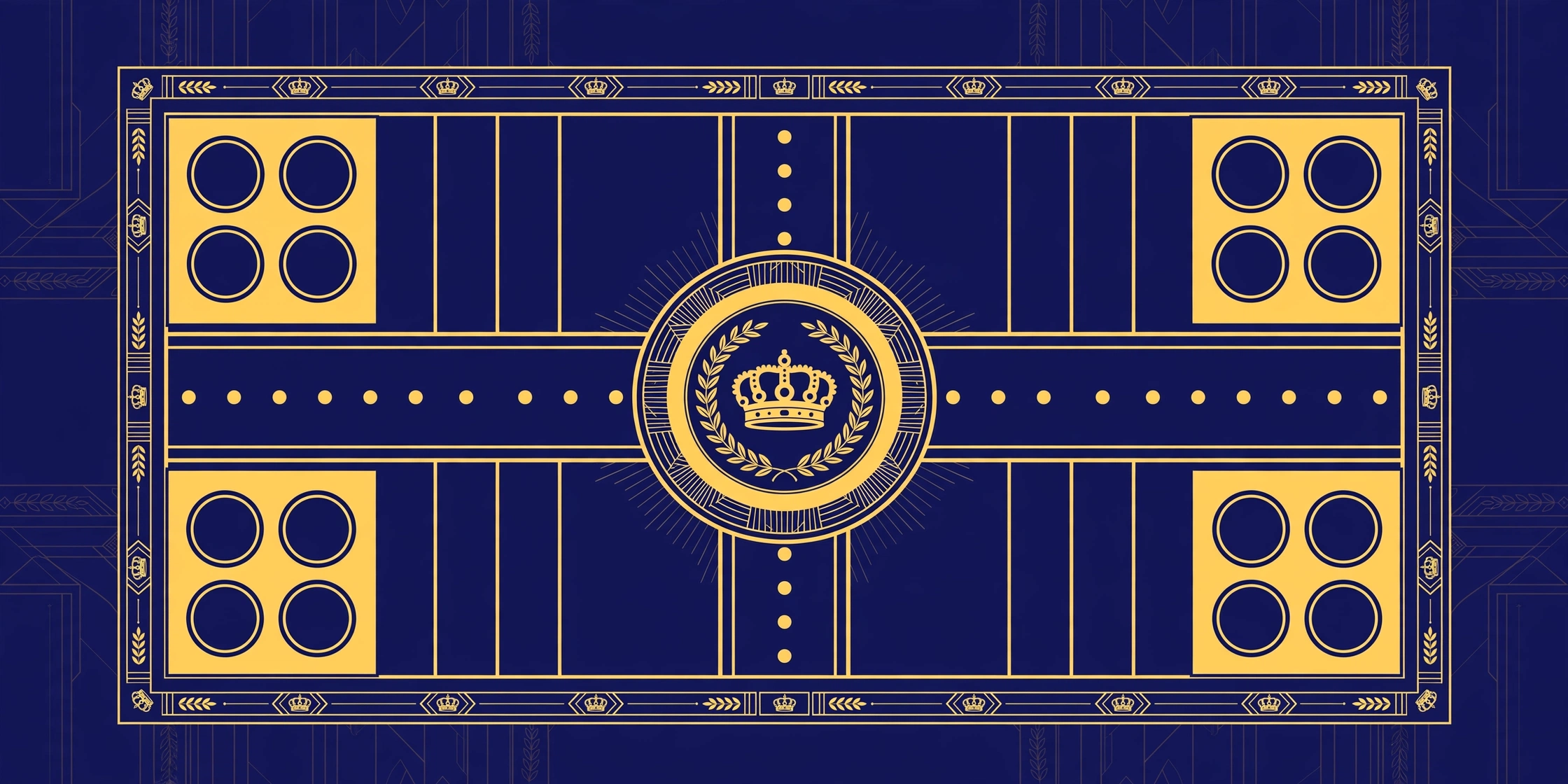
I've designed and printed enough boards to know which combinations sing and which ones scream. Here are 8 premium themes with exact hex codes — plug them into the board designer's custom color pickers and watch a basic board turn royal:
| # | Theme | Four quadrant colors | Best occasion |
|---|---|---|---|
| 1 | Royal Navy & Gold | #1B2A4A · #C9A227 · #2E4057 · #8C6A1F | Weddings, anniversaries |
| 2 | Maroon Heritage | #7B1E26 · #D4A017 · #5C141B · #E8C547 | Diwali, traditional gifts |
| 3 | Emerald & Ivory | #1E5B4A · #F5F0E1 · #2E7D5B · #D9C58A | Housewarming, parents' gift |
| 4 | Midnight Neon | #0F0F1A · #00E5FF · #FF2E88 · #FFD400 | Teens, gaming vibe |
| 5 | Desert Sand | #C89B6D · #8C5E3C · #E8D5B5 · #5B3A29 | Rustic, earthy feel |
| 6 | Blush Pastel | #F4A7C3 · #A8D8EA · #F9E79F · #B8E0D2 | Kids, baby shower |
| 7 | Crimson & Charcoal | #C0392B · #2C3E50 · #E74C3C · #7F8C8D | Modern, minimal homes |
| 8 | Tricolor Pride | #FF9933 · #FFFFFF · #138808 · #000080 | Patriotic occasions |
Why these work (the 30-second color lesson)
Premium-looking boards follow one rule: contrast with restraint. Each theme above pairs deep, saturated colors with one light accent (cream, ivory, gold). The deep colors give richness; the light accent gives breathing room. Boards that look cheap do the opposite — four equally loud brights with nothing to rest the eye on.
The second rule: limit your palette. Four quadrant colors plus one medallion color plus one text color. That's it. Every extra color you add dilutes the premium feel. The Royal Navy & Gold theme looks expensive precisely because it's basically two colors doing all the work.
Matching themes to occasions
Weddings: Royal Navy & Gold or Maroon Heritage. These photograph beautifully and match traditional wedding aesthetics. See our wedding return gift guide for the full playbook.
Diwali gifts: Maroon Heritage or Emerald & Ivory. Festive without being garish, and they look stunning next to diyas.
Kids: Blush Pastel for young kids, Midnight Neon for teens. Never give a 12-year-old a pastel board unless you enjoy being ignored.
Corporate/family name boards: Crimson & Charcoal or Emerald & Ivory — professional, tasteful, shelf-worthy. Our family name template guide pairs well with these.
Colors and printing: what changes on paper
Screen colors lie — a little. What looks like deep navy on your phone can print slightly purple; golds can print mustard-y. Two defenses: first, always do a test print (one A4, draft mode, costs almost nothing). Second, know that matte paper deepens colors while glossy paper brightens them. For royal themes, matte art paper is the move — it gives that rich, velvety finish that screams premium.
Neon themes (Midnight Neon) are the exception: standard CMYK printers can't reproduce true neon. They'll print as bright-but-normal colors. Still looks great, just set expectations — you won't get glow-in-the-dark.
Text colors: the detail everyone forgets
Your quadrant colors are only half the design. Text color makes or breaks readability: gold or cream text on dark quadrants, dark navy or maroon text on light medallions. The classic failure is white text on a pastel quadrant — invisible. In the designer, set your text colors deliberately; don't leave them default. And test at arm's length — print a small test, hold it at playing distance, and read every label. If you squint, it's wrong.
Steal like an artist (safely)
Look at premium board game boxes, wedding cards, and hotel lobby decor — they all use the same deep+accent formula. There's no copyright on a color pairing like "navy and gold" — combinations aren't ownable. What you can't do is copy another brand's exact artwork or characters. Colors and combinations are fair game; logos and mascots aren't. All 8 themes above are original combinations — use them freely.
More design questions? The printing FAQ covers the practical side of turning these themes into real boards.
Start with theme #1
If you're overwhelmed by choice, just start with Royal Navy & Gold — it's the crowd-pleaser that never disappoints. It's the most universally loved combination — formal enough for weddings, warm enough for family, striking enough to photograph. You can always redesign later; the designer saves everything and the download is free. But I'd bet your first board becomes the keeper.
Build your own theme: the 60-30-10 rule
Interior designers use a 60-30-10 rule, and it works beautifully for boards too. 60% of your board should be one dominant feel — usually the track background (keep it white or ivory; readability lives here). 30% is your secondary color — two quadrants in your main theme color. 10% is the accent — gold text, a contrasting medallion, one surprise quadrant. Boards that follow this ratio look designed. Boards that split everything 25-25-25-25 look like a paint factory exploded.
Try it: take the Royal Navy & Gold theme and shift the ratio. Make the track ivory (60%), two quadrants navy (30%), and go wild with gold on the medallion and text (10%). Same colors, completely different energy from the all-navy version. Ratio is a free design tool — use it.
Seasonal palettes: a board for every festival
India gives you a design calendar for free. Diwali: Maroon Heritage with extra gold. Holi: take the Blush Pastel theme and saturate everything up two notches — bright pink, electric blue, sunny yellow. Rakhi: Tricolor Pride or Emerald & Ivory, something that feels like home. Christmas/New Year: Crimson & Charcoal with gold text. Wedding season: Royal Navy & Gold, always.
The lovely thing about the designer is that switching a board's entire theme takes about ninety seconds — same names, same layout, new soul. Some families now redesign their board every Diwali as a tradition. The old prints become a timeline of festivals. That's not a board anymore; that's an archive.
What to avoid: the hall of shame
Learn from others' mistakes. Neon everything: one neon accent is striking; four neons is a headache. Black backgrounds with dark text: surprisingly common, completely unreadable — if your quadrant is dark, your text must be light, no exceptions. Photo backgrounds behind the track: busy images under the playing squares destroy readability; keep photos in the medallion only. More than 6 colors total: count them — quadrants, medallion, text, track. Past six, the eye gives up and the board looks messy no matter how pretty each color is individually.
And the biggest one: designing only on screen. Colors shift in print — always, without exception. That perfect lavender might print slightly grey. The test print exists for exactly this reason. One A4 draft, thirty seconds of looking, and you'll catch every issue before the real print.
🎨 Try the royal themes — free
All 8 combinations are one click away in the designer, plus custom hex pickers.